Some projects start with a design brief. This one started with a realization. Leadpages—a pioneer in landing page and conversion software—had outgrown the brand it was known for. The company that once helped entrepreneurs “build something beautiful” was now powering businesses far beyond that first page. Their customers were more sophisticated, their product more capable, and their market more crowded. The brand needed to grow up—without losing the scrappy, creative spirit that made it famous in the first place.
That’s where we came in. Truax Marketing was brought in to lead the strategic rebrand of Leadpages: a SaaS category leader ready for its next stage of growth.
Finding the Story Beneath the Surface
Our first step wasn’t color palettes or logos. It was clarity. We partnered with the Leadpages team to dig into what had changed, not just in their business, but in their audience. Through interviews, workshops, and plenty of whiteboard time, we unpacked how customers actually saw Leadpages. What we found was a brand loved for its simplicity but underestimated for its sophistication.
As Ryan (our founder and lead strategist) put it during one of our sessions, “The best brands don’t just tell people what they do, they remind people why they matter.” That became our north star.
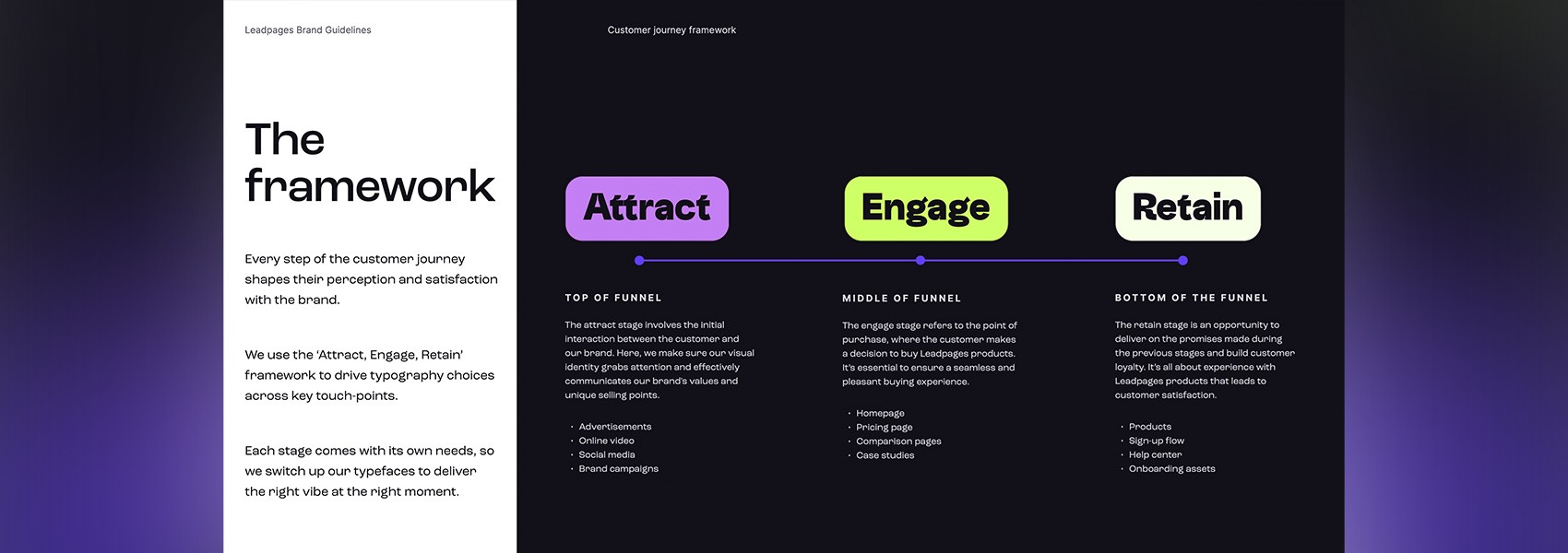
We built a new brand strategy framework around three things:
Reaffirming Leadpages’ role as the bridge between creativity and conversion.
Giving the brand a voice that felt confident but not overstated.
Creating room for the brand to grow so every new product or feature would feel right at home.

Client
Leadpages
Services
Brand development, Creative Direction, Messaging & positioning, Web Development and Content Creation
Project goals
Shifting Perception Through Positioning
Leadpages had long been seen as the tool for beginners. That wasn’t wrong, but it was incomplete. Our job was to evolve that perception — to show the world that Leadpages was not just easy, but powerful.
We refined their messaging and positioning pillars to focus less on the product itself and more on the problems it solves: empowering business owners to launch, grow, and scale with confidence. Every line of copy, from the homepage headline to the smallest tooltip, would speak to that customer-first philosophy.
We also introduced a new brand narrative, one that treated Leadpages not as a landing page builder, but as a growth platform. This shift reframed the brand from being a utility to being an enabler of success. It wasn’t about pages anymore; it was about possibility.
Making the Brand Look as Modern as It Felt
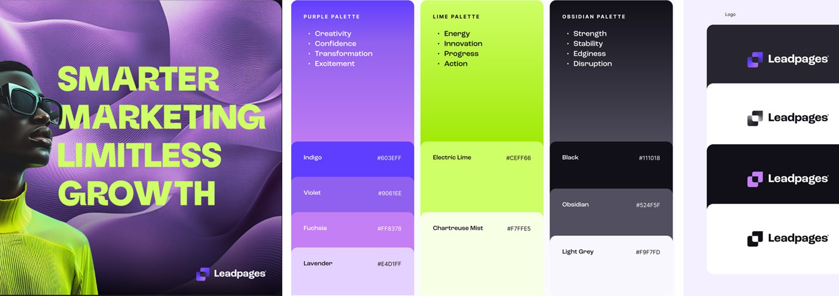
Once the strategy was locked, we turned our attention to the visual identity. The existing look while recognizable felt dated in a SaaS world defined by bold color, clean geometry, and accessibility.
Together with the Leadpages team, we rolled out a fresh visual system that balanced creativity with clarity. Modern colors brought warmth and depth; refined typography gave the interface confidence; a streamlined logo honored the company’s legacy while signaling its evolution.
It was about simplicity done with sophistication. The new design didn’t scream for attention, it earned it.
Building for Scale
Rebrands are only as strong as the systems behind them. So alongside the new identity, we built a content framework that made it easy for Leadpages’ team to scale their message.
The goal: empower every writer, designer, and marketer to create content that stayed true to the new brand without requiring a 200-page manual. We established flexible templates for everything from blog posts and landing pages to guides and ads, all grounded in the same voice and values.
We also developed campaign assets, ads, lead magnets, and landing pages that would put the new brand to work immediately. Each piece was crafted to feel unmistakably Leadpages: approachable, confident, and conversion-minded.
result
Seeing the Change in Real Time
By the time the new Leadpages site launched, the transformation was impossible to miss. The brand felt familiar yet fresh, rooted in what customers already loved, but elevated to meet where the company was headed.
Website visitors responded immediately. Engagement increased. Bounce rates fell. People stayed longer, clicked deeper, and, most importantly, converted more often. The new messaging resonated because it was built around real customer needs, not internal assumptions.

What We Learned (and Loved)
Rebrands are emotional work. They’re about more than color and copy, they’re about identity, confidence, and timing. What made this one special was how deeply the Leadpages team leaned into the process. They didn’t just want a new coat of paint; they wanted a brand that matched their ambition.
For us at Truax, it was a reminder that great branding is equal parts creativity and restraint. The best rebrands don’t reinvent, they reveal.
And while we take pride in the strategy, messaging, and design systems we built, the real success story belongs to Leadpages. They’ve carried the new brand forward with purpose, expanding their content ecosystem, growing their audience, and reestablishing their voice in a crowded market.
When we look back on this project, we see more than a rebrand, we see a moment of renewal. A company stepping confidently into its next chapter, and a partnership that helped them get there.


